
Improved Functionality for an Easy-to-Use, Columbia-Branded, School of General Studies Web Site
The School of General Studies (GS) had four separate sites that were initially launched in 2008. The sites were confusing to navigate, not mobile-friendly, and did not meet basic accessibility standards. Additionally, much of the content was out-of-date and in need of an overhaul.
The goals of the redesign included:
Improve the findability of information
Highlight academic, admission, and financial aid information
Build a distinctive yet consistent experience for GS and postbaccalaureate students
Refresh outdated content; eliminate useless content
Modernize the visuals following web design best practices
Stakeholders chose to utilize Columbia Sites templates to address many of the goals while simplifying the redesign process.
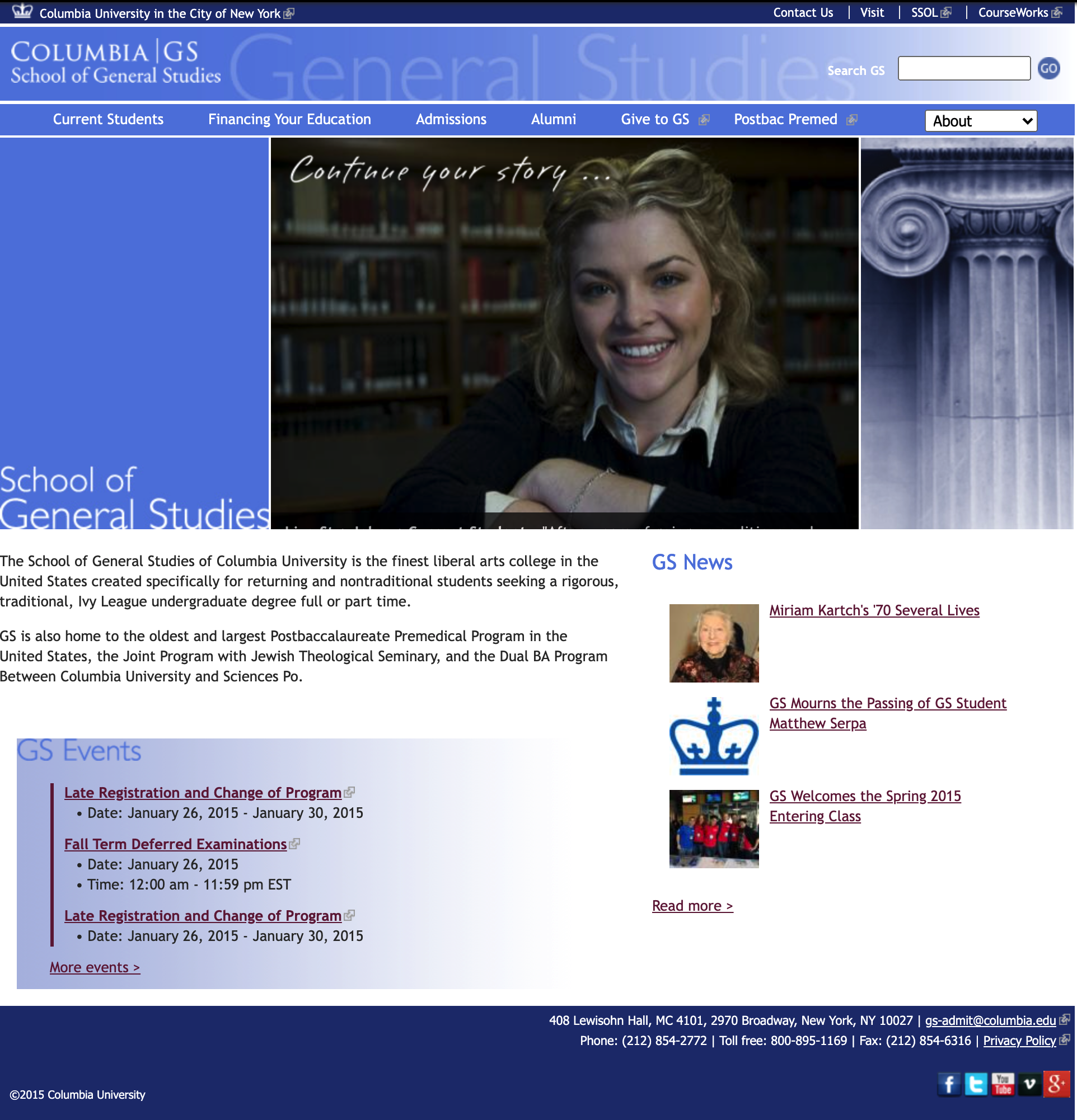
An outdated main GS Site that was launched in 2008.
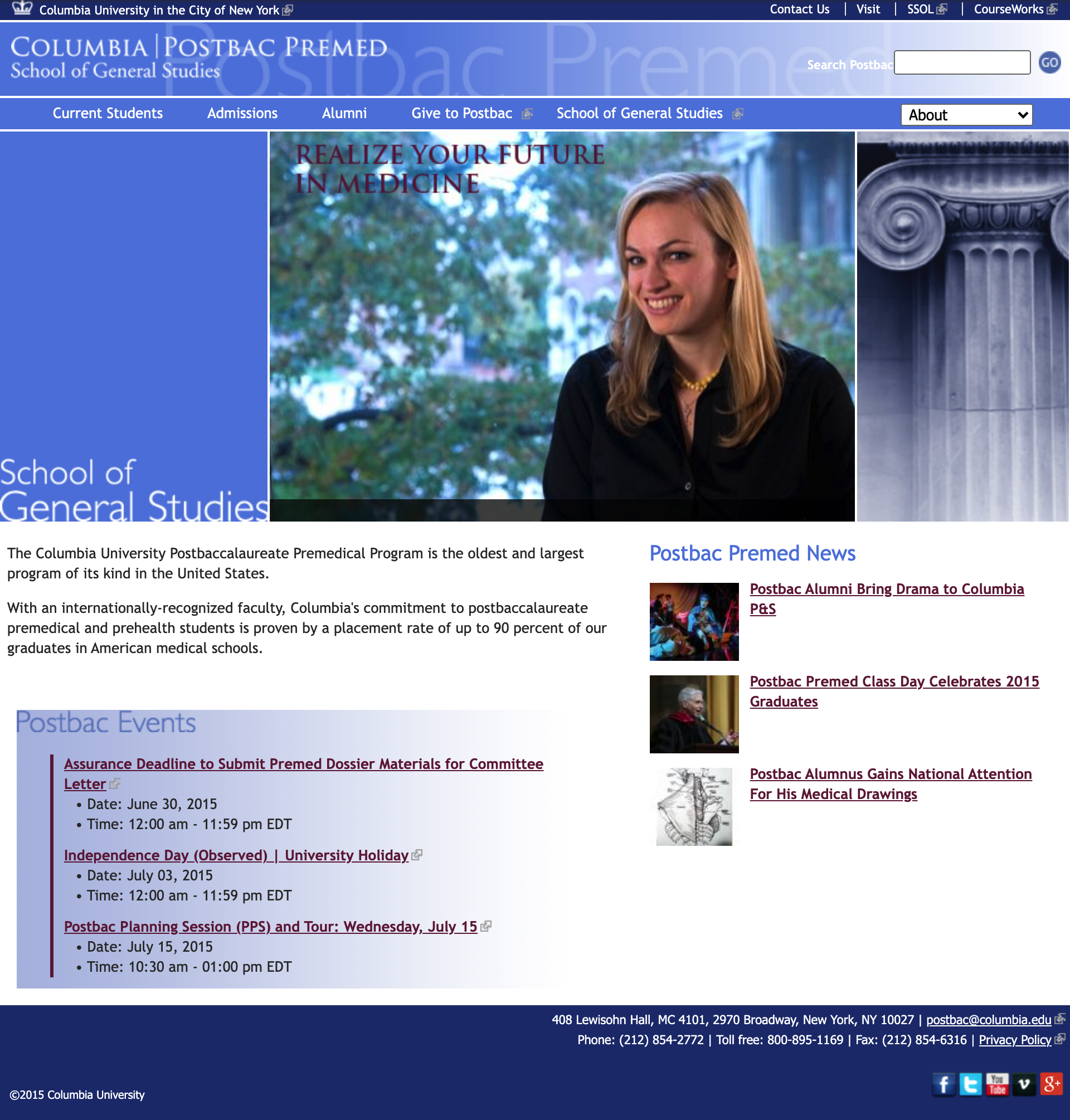
A cloned of the main site to feature the Postbac program.
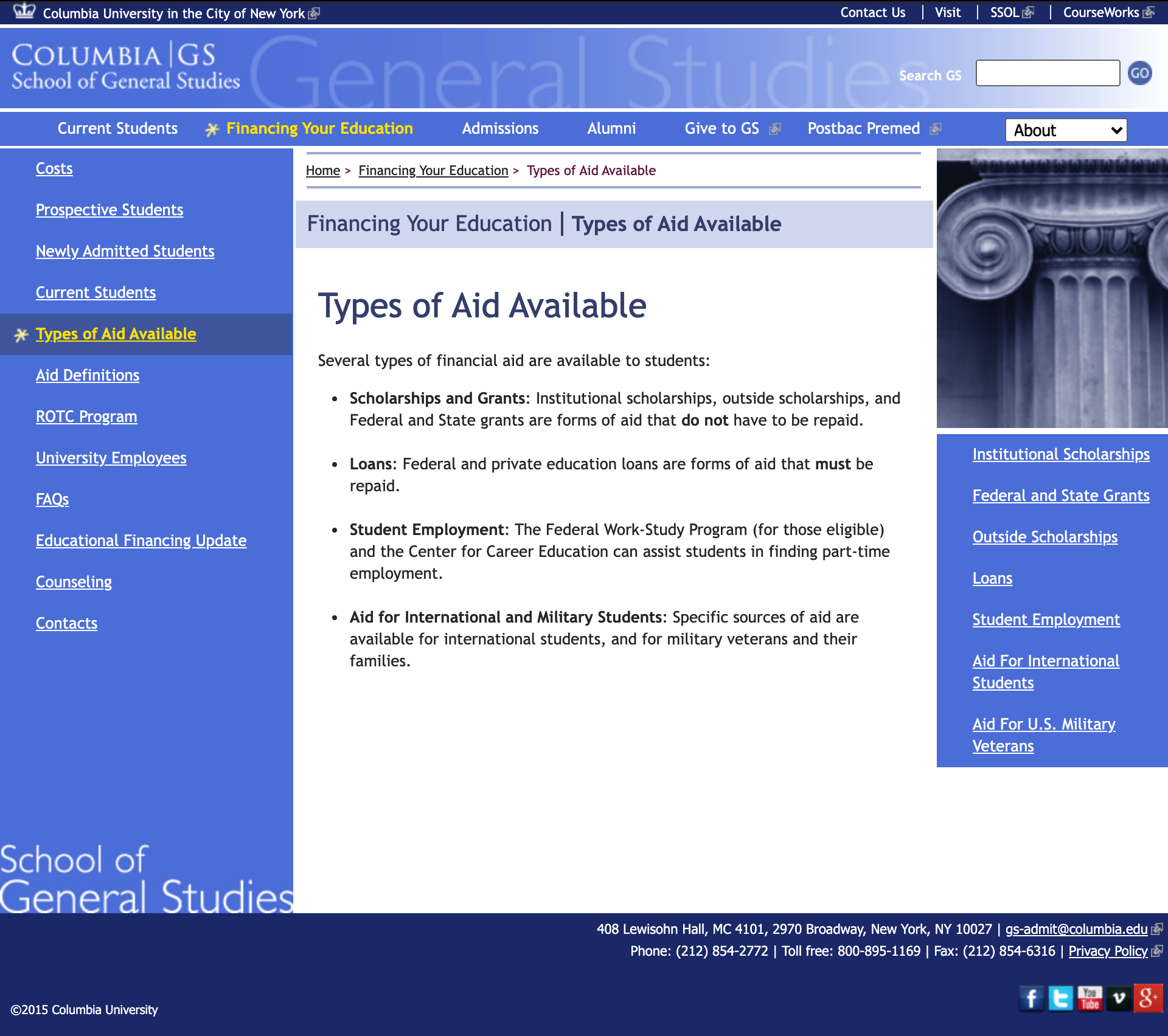
Sample of a three column interior page with five level deep of content.
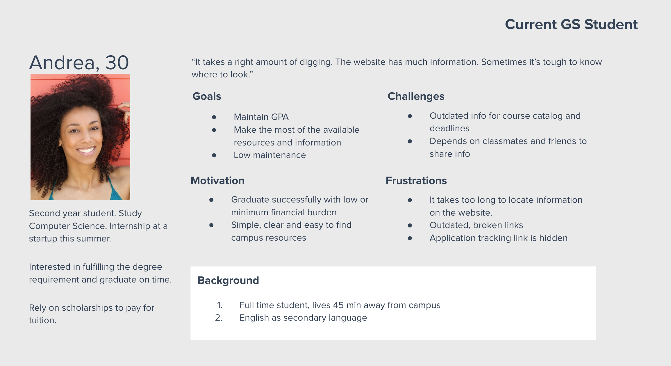
““The site has a lot of outdated resources and broken links. It has a lot of silo content. I have to dig.” ”
Research
We used a variety of quantitative and qualitative methods to determine what was and wasn’t working for the target users:
Interviews with students, staff, and stakeholders.
Survey sent to all GS students.
Competitive analysis
Heatmap analysis, analytics, and benchmark usability.
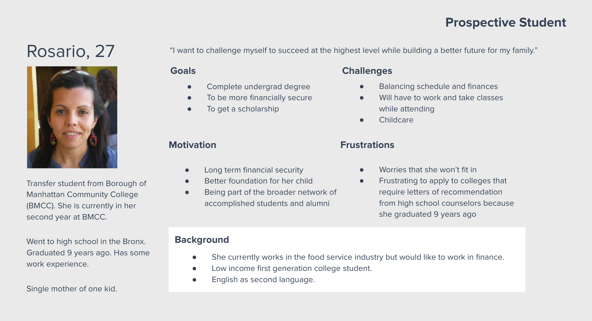
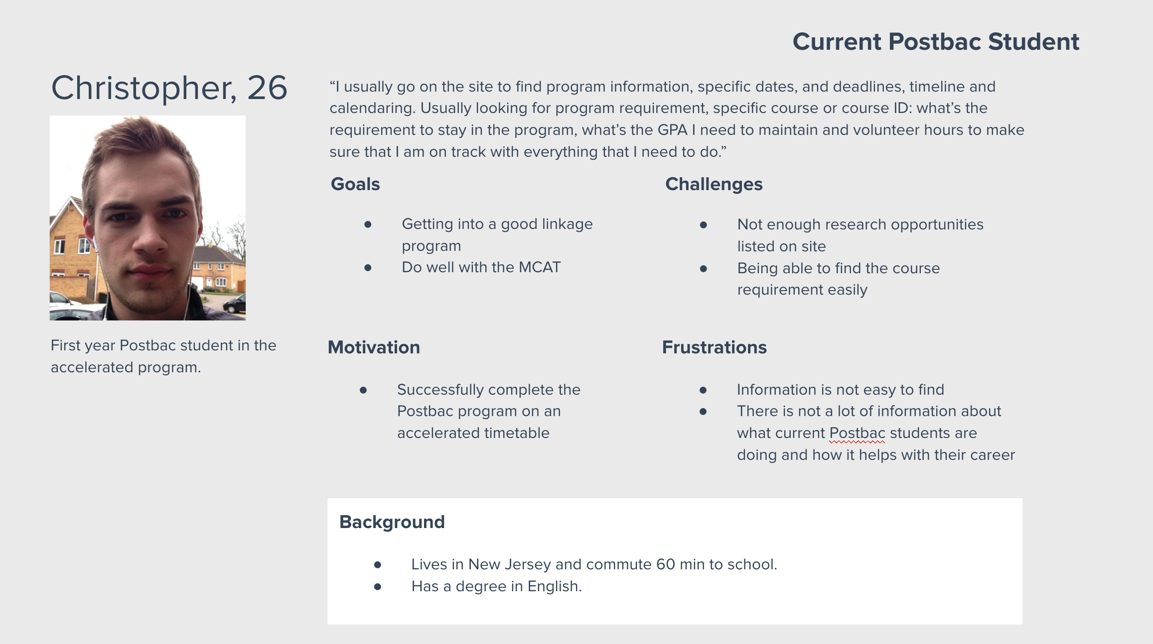
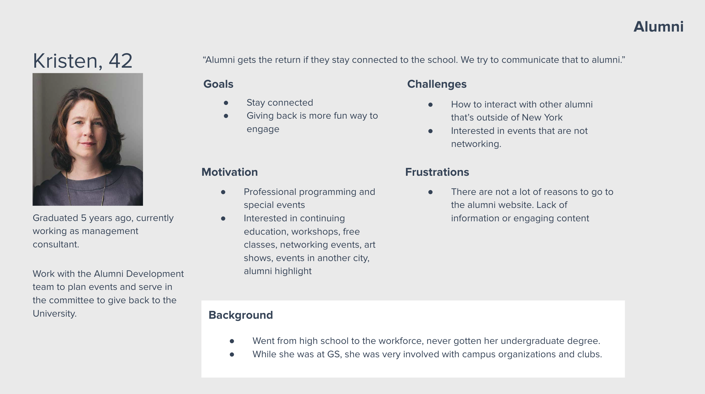
User Personas
Ideation Workshops
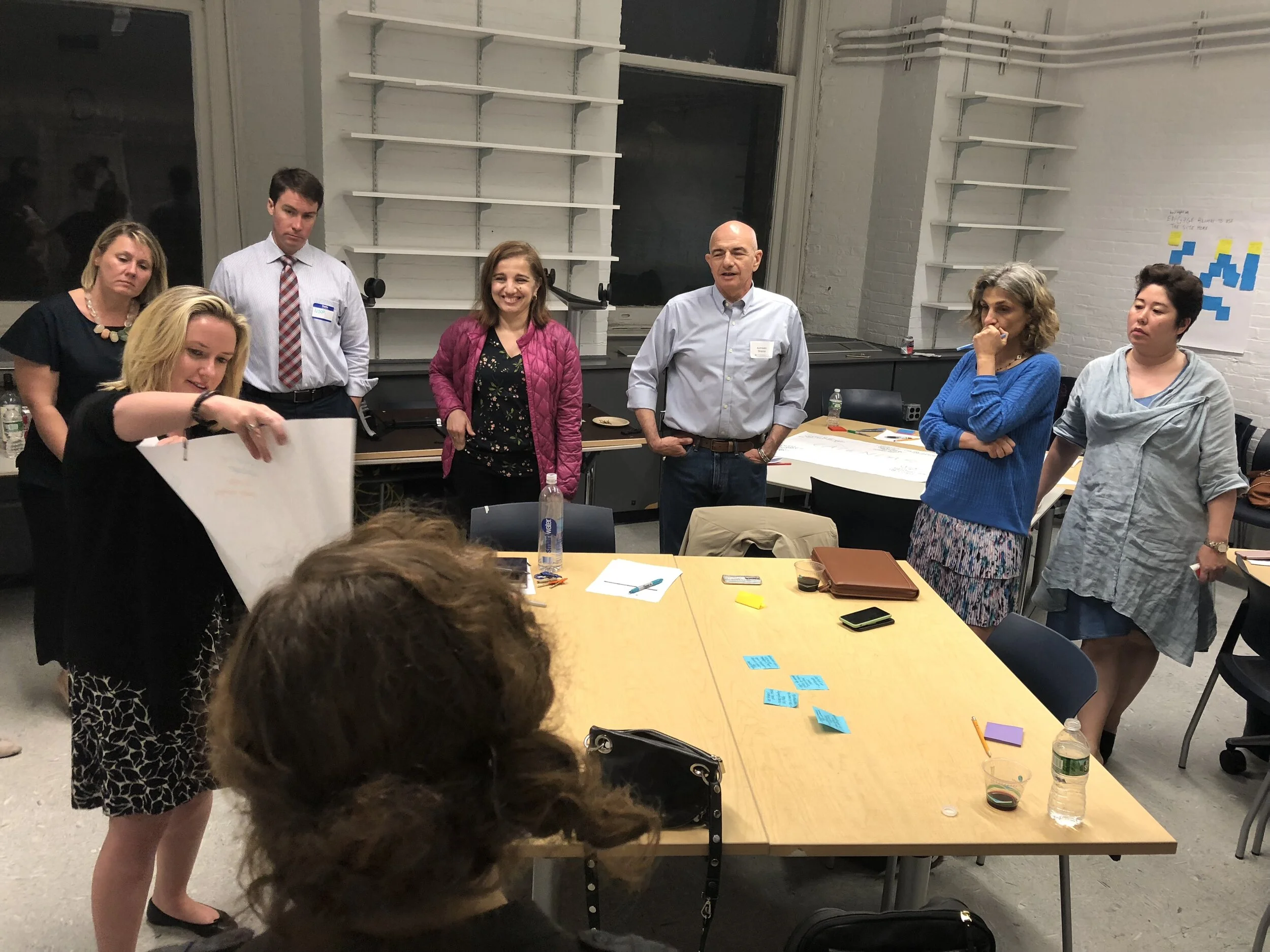
We conducted three ideation workshops based on design thinking to get interactive feedback from our students and stakeholders. By bringing the department’s stakeholders into the same room with students, we achieved consensus for a user-first approach.
The findings from the workshops aligned with our other research:
Key content such as student life and student services, financial aid, and family-related resources were buried and difficult to find.
The site was not accessible and wasn’t optimized for mobile devices.
The application process was stressful and confusing for students.
-

Workshop Day 1
-

Workshop Day 2
-
Workshop Day 3
Information Architecture
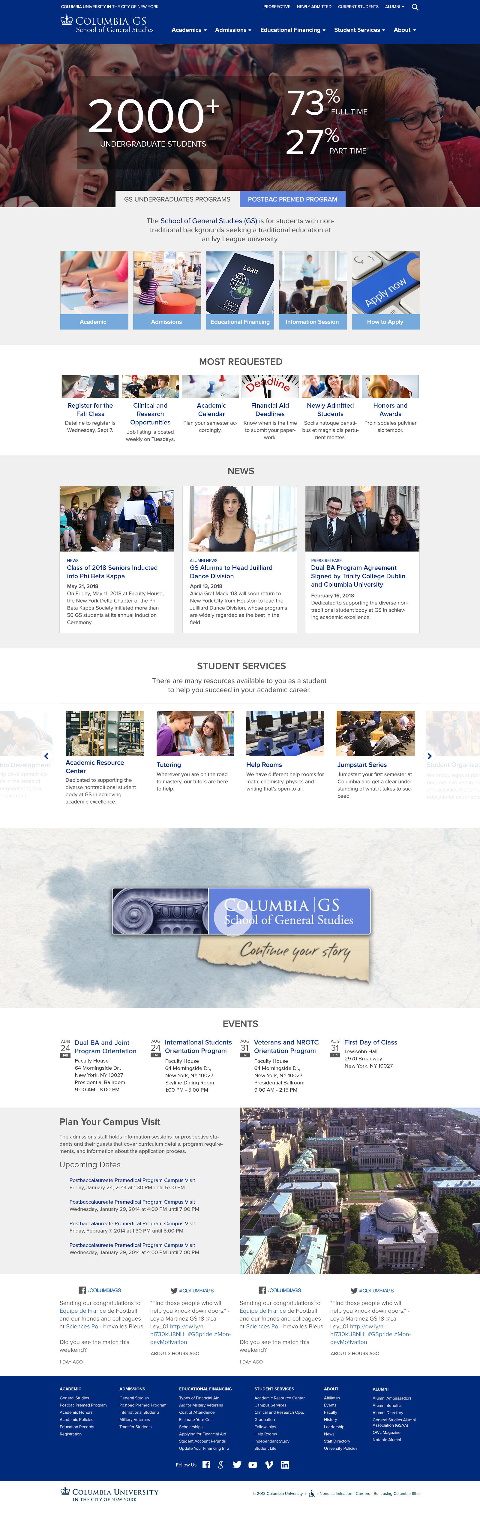
Based on data collected from our research, we proposed a new site map that addressed users’ needs as well as the school’s business goals. The most important change was consolidating the content from the four separate original sites into a single cohesive site that was easy to navigate. The most important content, both for students and stakeholders, were highlighted so users could find what they needed quickly. Features included:
A prominent “schedule an advising appointment” as the main CTA on the homepage.
A “most requested” section to feature content that's most relevant to students, such as important deadlines.
Separate sections for information for the General Studies and postbaccalaureate programs that each highlighted important information around admissions, financial aid, and events.
Space to feature content to drive donations, such as an article or alumni spotlight.

We consolidated thousands of pages into these core content groups.
The final design of the new site before it was built.